STOP REMOVING INFORMATION (rant)

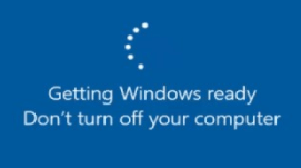
Windows 10
Modern ux/ui design is obscuring a lot of information that could be very useful for diagnosing problems which leads to a lot of wasted time. The Windows loading circle for example is it:
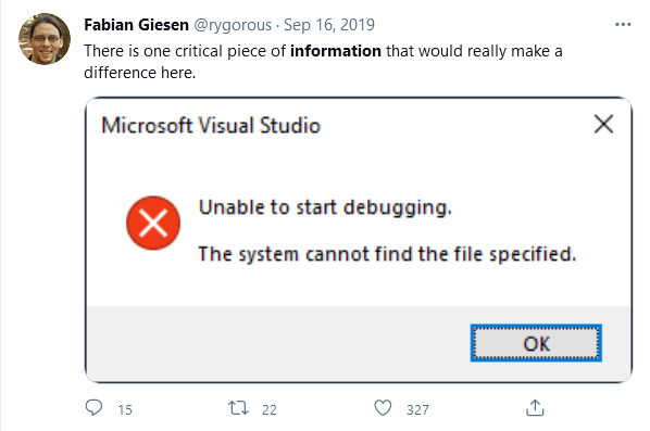
Visual Studio 2019

WHAT FILE WAS IT?!
Not to harp on Windows but I notice a lot of things have gradually shifted to giving less and less useful information over time and I don’t know why. Is it because it would scare the end user?
Gimp
![]()
In gimp, the default icon theme is now the bottom left, all grey. I see color first, then icons. If I need the eraser, I just look for pink. Now I have to squint sometimes to look for it, especially gets harder when my blue light filter cranks up.. It was fine before.
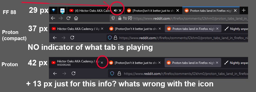
Firefox

Firefox’s new “proton ui” removed the sound indicator for the tab that is playing music making it INCREDIBLY hard to find tabs.
I could go on and on but I think you get the point.
“If it ain’t broken, don’t fix it” rings much true for UX/UI design more than anything so please for the love of god,
Please stop pointless UI re-designs.
Please stop the “minimalism” trend/asethetic of obscuring information.
Please just stop.